Find everything you need to keep our brand consistent. All in one place. For media inquiries, you can reach us at team@bimengine.ai.
TONE & POSITIONING
TONE & POSITIONING
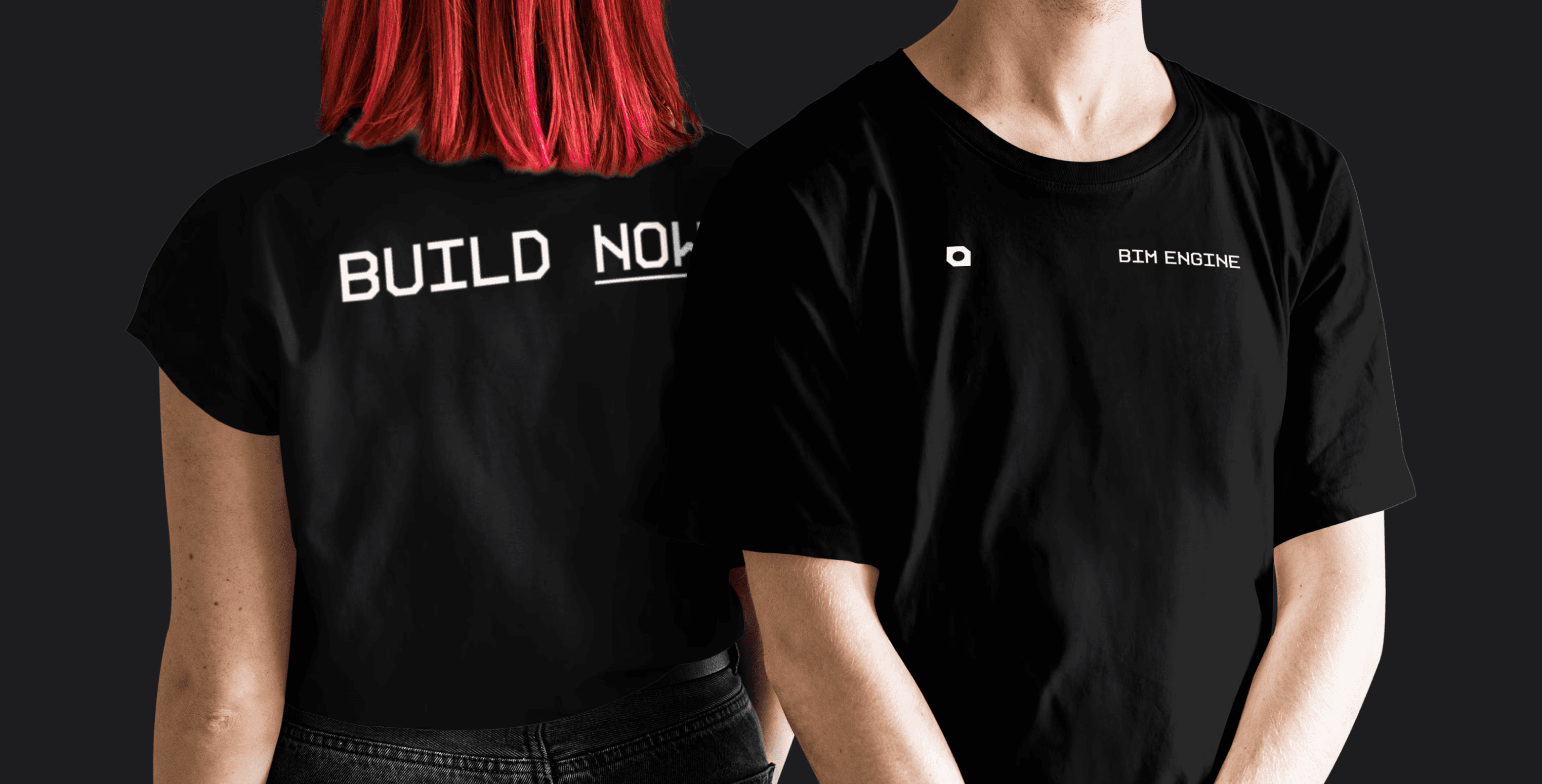
our logo
The BIM Engine logomark is our core symbol. A geometric form built from isometric and axonometric angles. It’s clean, technical, and grounded in the visual logic of BIM itself.
Designed to feel engineered and precise, this shape represents our modular approach to building both in brand and product.
our logo
Our wordmark is custom typeset from the KH Interface font. Its angular cuts and rigid geometry echo the structural foundations of BIM Engine, sharp, functional, and confidently built.
The spacing is subtly tuned using the KH font’s downstrokes as reference points, creating a rhythm that feels deliberate and engineered.
our logo
The logomark appears most often in monochrome: solid black or white depending on context. This treatment ensures maximum legibility and consistency across all brand surfaces.
It’s the primary expression of the BIM Engine brand used wherever the product shows up, from the app icon to internal docs.
our logo
Our wordmark is custom typeset from the KH Interface font. Its angular cuts and rigid geometry echo the structural foundations of BIM Engine, sharp, functional, and confidently built.
The spacing is subtly tuned using the KH font’s downstrokes as reference points, creating a rhythm that feels deliberate and engineered.
our logo
The favicon is a distilled version of the logomark – minimal, sharp, and instantly recognizable. It ensures brand presence and clarity in even the smallest digital spaces.
our logo
Our social icon also uses the logomark on its own leveraging its bold, engineered shape to stand out across platforms.
It’s designed to be distinctive, confident, and unmistakably BIM Engine in any feed or profile.
COLORS
Our core palette is simple and monochrome: black, white, and grey. These tones reflect the brand’s engineered foundations, bold, precise, and professional.
They create contrast, clarity, and focus, echoing technical drawings, printed plans, and the BIM environment itself.
COLORS
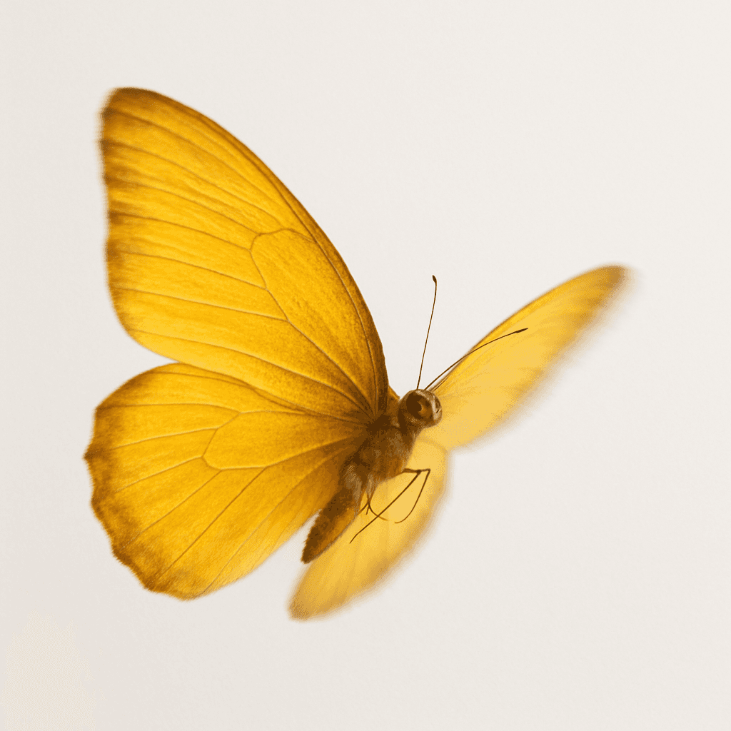
Our secondary palette draws from heatmaps and agent visualisation.
Bold, vivid tones that cut through the monochrome. These colours echo the butterfly — symbolising energy, motion, and the intensity of BIM Engine in action.
COLORS
Use the logo colour treatments shown here to maintain strong contrast and clarity across backgrounds. The monochrome mark should be used on both light and dark backgrounds as specified,
COLORS
Use the logo colour treatments shown here to maintain strong contrast and clarity across backgrounds. The monochrome mark should be used on both light and dark backgrounds as specified,
typography
BIM Engine uses Geist as our core
typeface across all communications.
Use Light, Regular, Medium, and
Semi Bold weights for headings,
body copy, subheadings, UI, and buttons.
Settings:
Letter spacing: -4%
Line spacing:
– Headlines: 90%
– Body and other: 110% to 130%
typography
For all numeric values and data displays, we use Geist Mono.
Use the same settings as our primary typeface to ensure consistency.
Settings:
Letter spacing: -4%
Line spacing: 110% to 130%
typography
The BIM Engine wordmark is typeset in KH Interface, a key reference in our visual identity. KH Interface may also be used for standalone headings, especially when a more engineered or industrial tone is needed.
Do not combine Geist and KH Interface.
Settings:
Letter spacing: -4%
KH Interface
Light
Regular
a
Bold
brand elements
Our supporting icons extend the visual language of the BIM Engine brand. Built from the same core geometry as the primary logomark, these symbols reinforce platform concepts in a simple, abstract way.
Assembly: Placing a component within a BIM model
System Layers: Layer transitions, hierarchy, and depth
brand elements
These modular brand elements are derived directly from the BIM Engine logomark.
Extended, rotated, and recombined into visual forms that represent ideas like (but not limited to) Foundation, Direction, Collaboration, and Convergence.
Designed to bring rhythm, movement, and brand cohesion across UI, layouts, and motion.
brand elements
Curved corners are used intentionally, typically on outer forms to soften the silhouette and introduce visual rhythm, while inner forms and embedded elements remain rigid and angular to reinforce structure and clarity.
Why It Works
Curved exteriors soften and modernise the system
Rigid interiors keep it sharp, fast, and architectural
This combination creates a system that feels engineered, but not mechanical and expressive without losing precision.
Corner Radius
Set your brand element (logomark, icon, or supporting shape) to 1000px height as a working reference.
Apply a 20px corner radius (2%) to outer corners only.
This ratio stays locked.
As elements scale, the radius scales proportionally.
Angles & Geometry
Stick to hard, axonometric angles
— 30°, 45°, 60°, and 90°.
These forms mirror architectural drawing logic and give the system its structured, engineered character.
Agent Imagery
As part of BIM Engine’s evolving visual world, select symbols are used to represent key products or functions — adding life, metaphor, and unexpected contrast to the otherwise industrial brand system.
These symbolic images help humanise our agent technology, while keeping things expressive and slightly unhinged.
Current associations include:
🦋 Butterfly – AI Agents
🐆 Snow Leopard – Built Robotics
🦈 Mako Shark – BIM Data
Agent Imagery
01. Research Phase
– Source reference images of the target butterfly
– Ask ChatGPT to describe its visual characteristics
→ save as Prompt 1
02. Prompt Engineering
– Copy the butterfly prompt template from Notion
(ask aurora@bimengine.ai)
→ save as Prompt 2
– Merge Prompt 1 and Prompt 2 using ChatGPT
→ this becomes Prompt 3
– Use Prompt 3 to generate the butterfly image
03. Photoshop Processing
– Open Photoshop template from Google Drive
(ask aurora@bimengine.ai)
– Canvas size: 3000×3000px
– Color space: sRGB
– Smart Filters enabled
(swap in butterfly, shark, or plant assets)
Edit sequence (if required):
Remove background → Add noise → Vibrance → Brightness → Teal/Purple Gradient Map → Export PNG